Problem: “Tapa Dura” bookstore needed a visual identity capable of connecting with a younger audience while maintaining the classic and cultural essence of the literary world. The challenge was to stand out from larger retail chains by conveying warmth, a passion for reading, and a contemporary aesthetic that invites people to rediscover the joy of books.
Objective: To create a brand with a strong, elegant, and modern visual voice that reflects the love for books and the value of printed stories. The goal was to develop a cohesive and easily recognizable identity across both physical and digital platforms, from signage and stationery to social media and promotional campaigns.
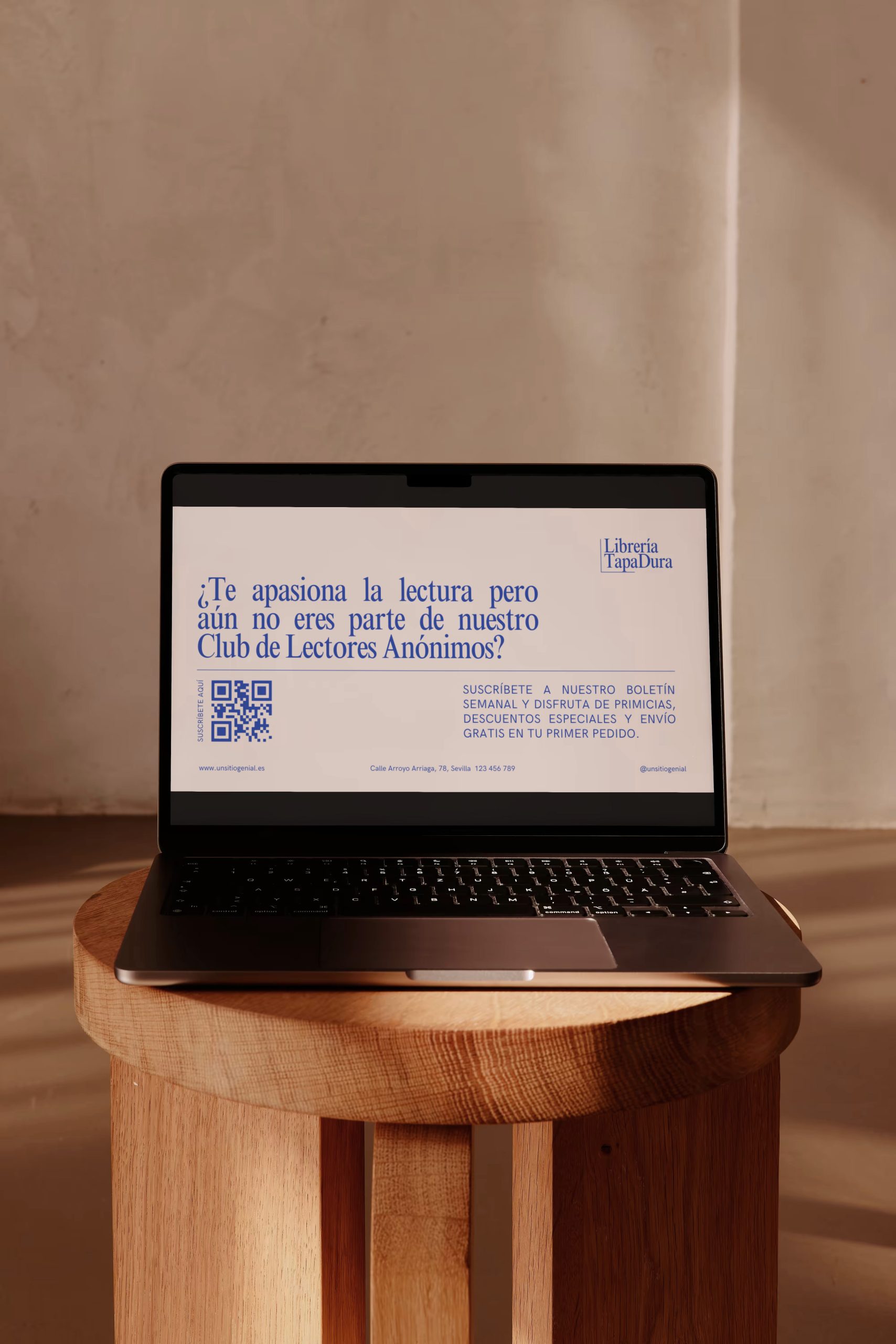
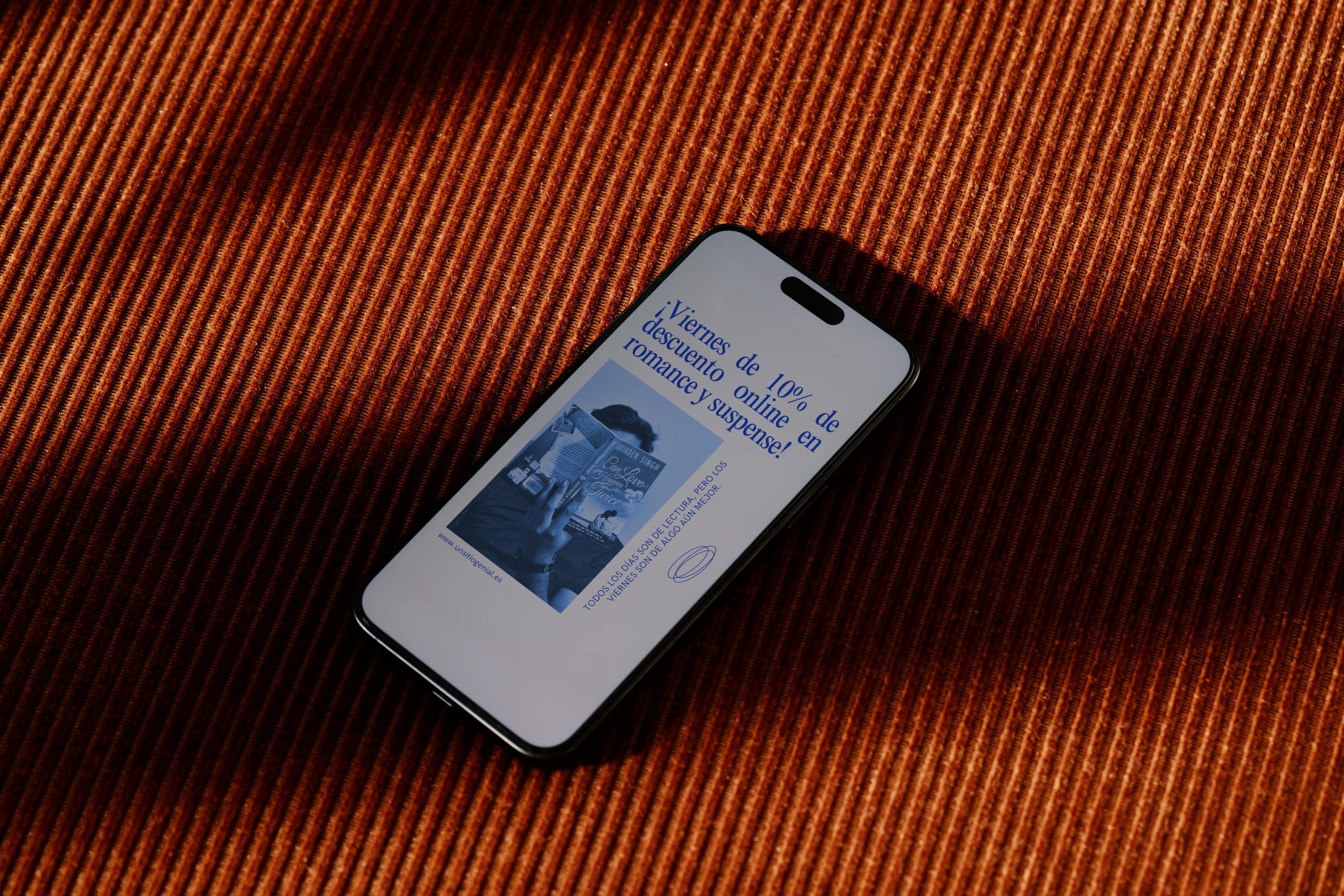
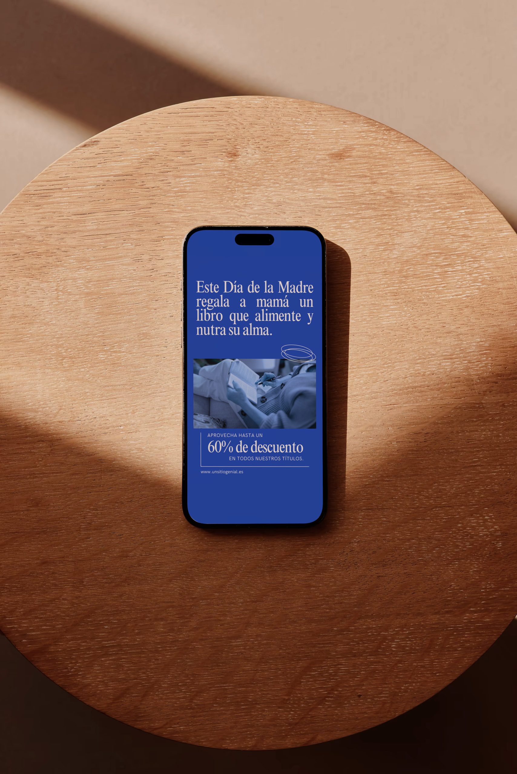
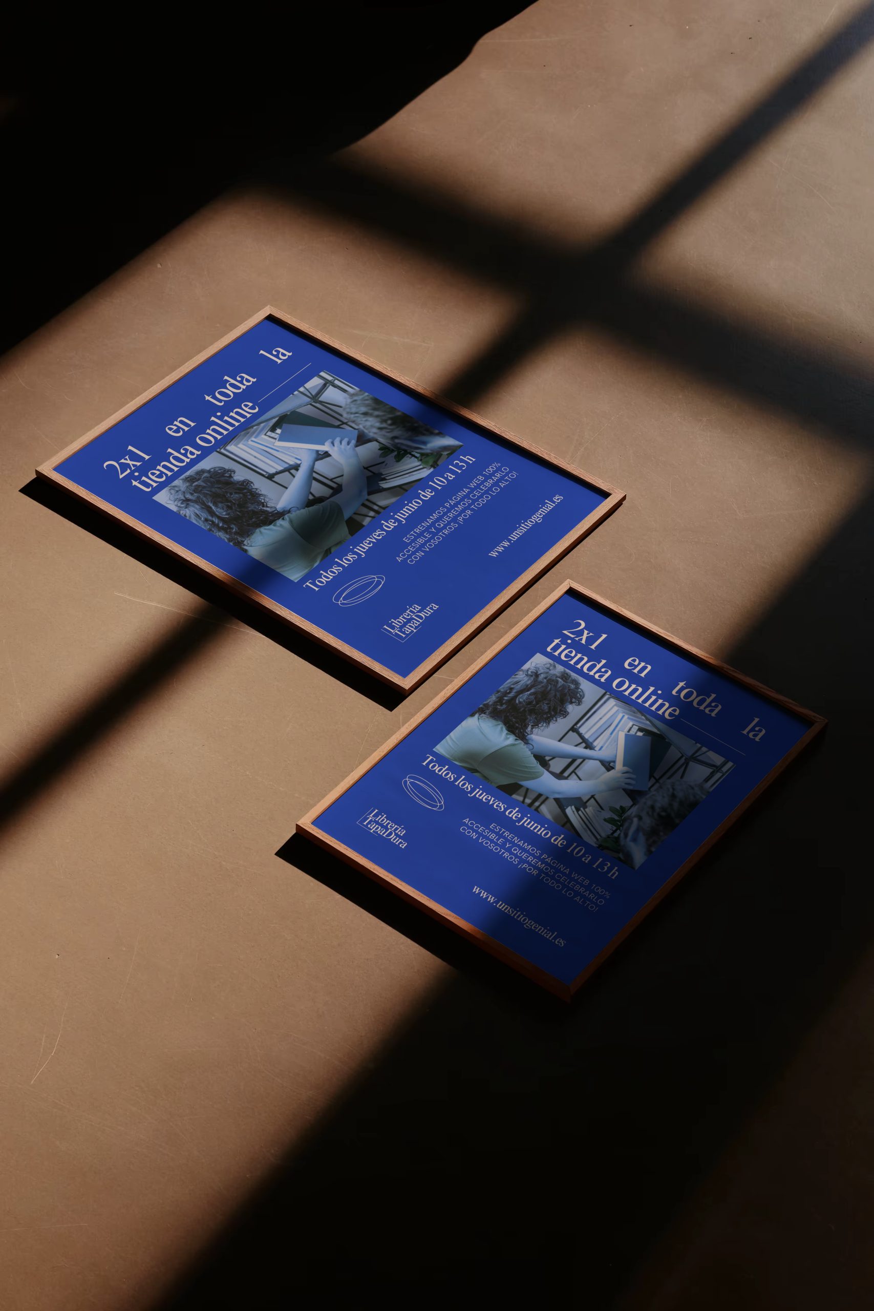
The design was built around typography as the main visual element.
The color palette revolves around a deep blue, associated with trust, culture, and calmness, while the minimalist composition brings balance and readability.
Different applications were developed , logo, bookmarks, stickers, posters, social media assets, and merchandising items, aiming for harmony between the editorial and contemporary worlds.