Siroko
Siroko is a modern and dynamic sports brand that has quickly established itself in the market thanks to its commitment to quality, innovation, and style. Specializing in the production of sports sunglasses, clothing, and accessories, Siroko combines advanced technology with bold design to offer products that not only enhance athletic performance but also stand out for their aesthetics. Siroko’s vision is to make high-quality sports equipment accessible to a wide audience, democratizing access to performance and fashion in sports. With a focus on functionality, durability, and comfort, Siroko has become a preferred choice for athletes and sports enthusiasts worldwide.
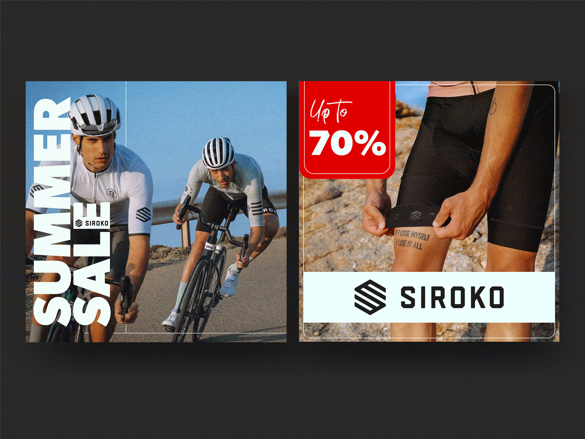
The objective of these creatives for the “Summer Sale” campaign is to create a design that is impactful and aligned with Siroko’s brand identity. The design must include the brand logo, be clear and eye-catching, and adapt to the Story (1080 x 1920) and Feed (1080 x 1080) formats in JPG.
For the “Summer Sale” campaign, I created a striking graphic design aligned with Siroko’s identity, following the objective of being eye-catching and clear in both Story (1080 x 1920) and Feed (1080 x 1080) formats. My inspiration comes from Siroko’s own logo, and I’ve incorporated its distinctive lines throughout the design to achieve a modern and cohesive style.
I selected photographs that evoke summer, fun, and style, capturing the essence of the campaign. These images, inspired by places like Mallorca, reflect the spirit of cyclists seeking elegance and enjoyment as they descend the mountains.
For typography, I chose Gibson Bold, a sans-serif font with a strong personality that adds a striking geometric style, perfectly in tune with Siroko’s character. For the “Up to,” I used a script font that creates a casual contrast with the geometric typography, adding a dynamic and appealing touch to the design.
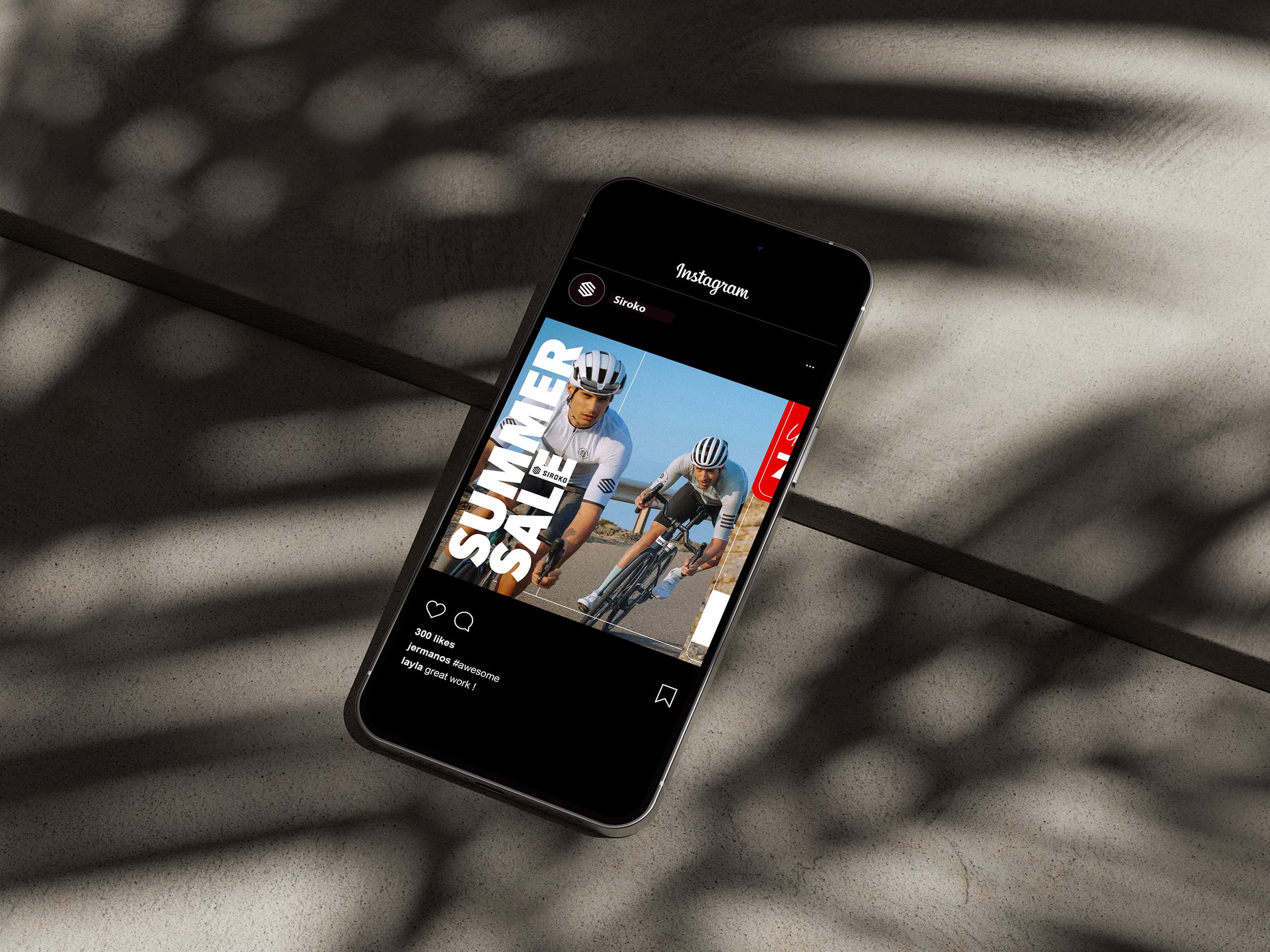
To add an extra touch of creativity and capture attention, I’ve implemented a subtle visual trick in the design. The first carousel image is designed to appear as a static image at first glance, but it’s actually a video that subtly reveals the second carousel image.
This approach piques the user’s curiosity, as the discount isn’t fully visible at first. By swiping to the right, the second image is revealed, displaying the discount.
This technique not only creates a striking visual effect made with After Effects but also increases engagement by encouraging users to pause and interact with the content. Additionally, since it’s a carousel, the second creative is likely to reappear, maximizing its impact on the target audience and ensuring greater visibility for the message.
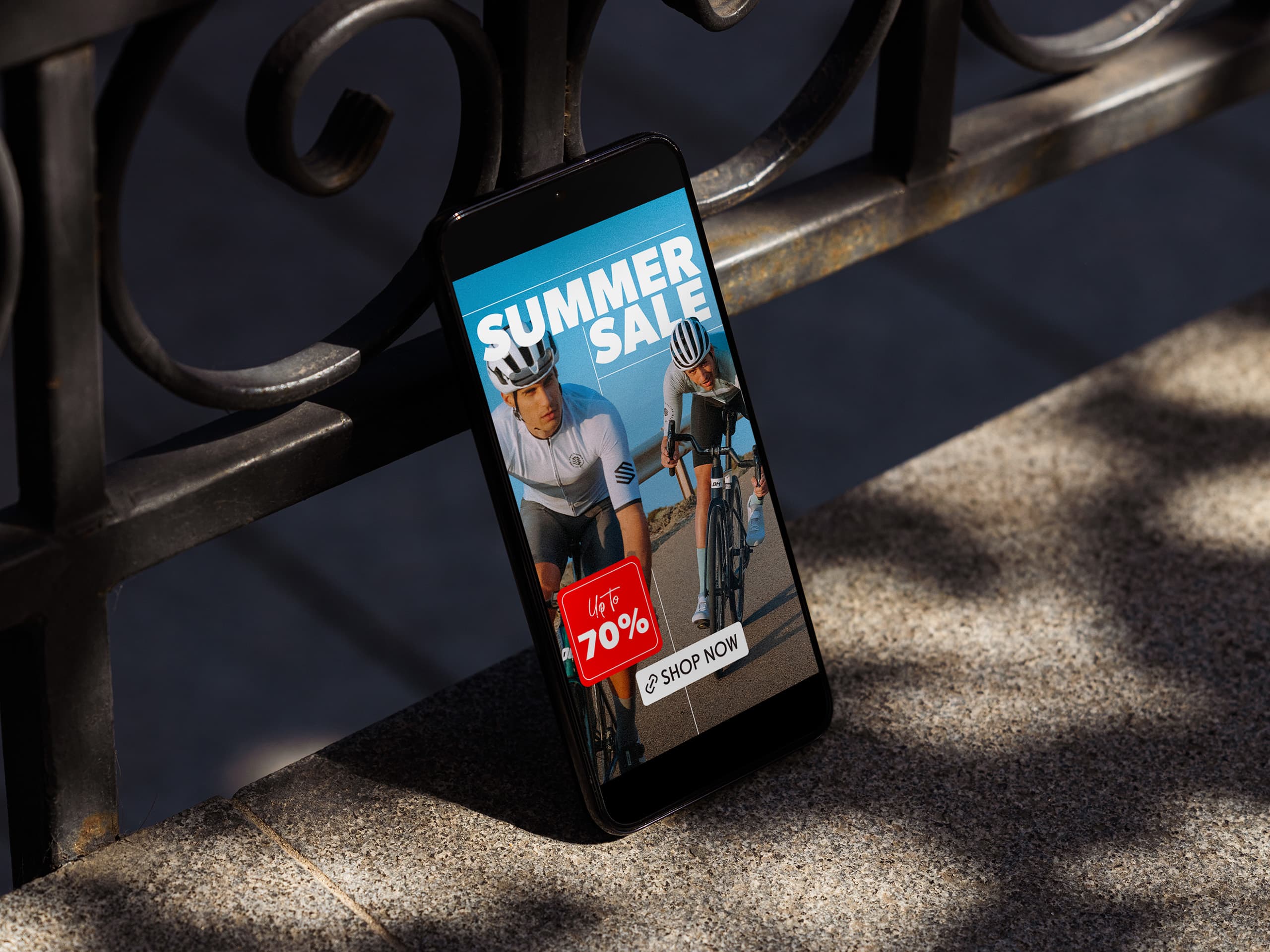
In the Story design, I maintained the same style and images to ensure consistency with the “Summer Sale” campaign. I chose to place the text horizontally instead of vertically to make it easier to read. Since Stories have a limited viewing time compared to posts, I wanted to ensure the text is clear and easy to read quickly. This layout helps make the message more accessible and effective within the brief exposure time of Stories.
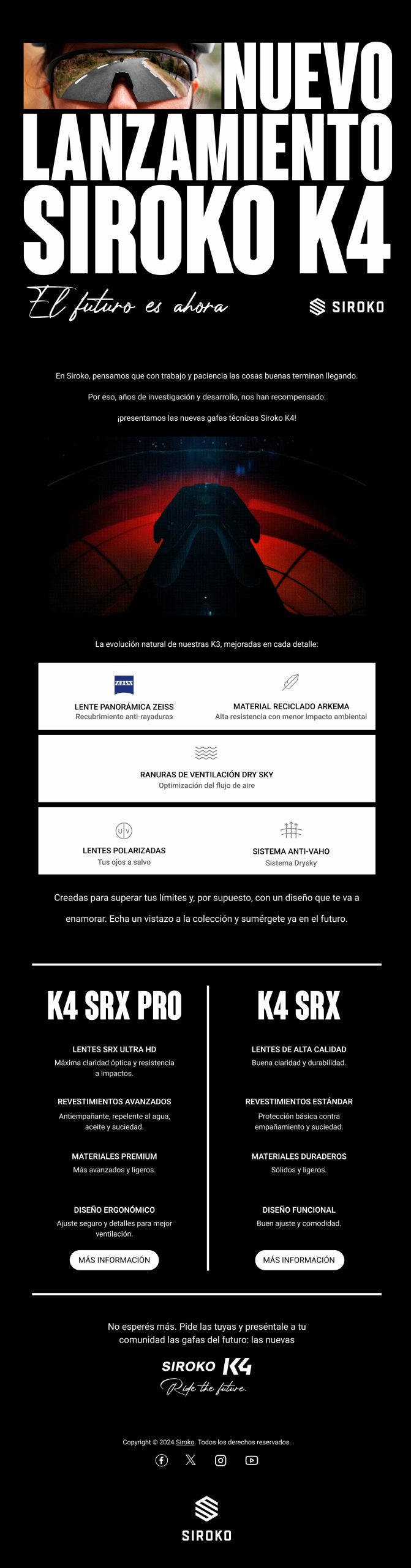
For the newsletter design, I maintained Siroko’s essence and signature style, using the brand’s distinctive black and white colors. I opted for a black background to create contrast with the usual white of emails, achieving a visual impact that highlights the content. I followed the same style as in the posts and stories, using a geometric sans-serif font (Coluna) for the title, which adds a modern touch and aligns with the current trend of typographic maximalism. This bold, eye-catching title is designed to immediately grab attention. For the body text, I chose the Roboto font, known for its readability, which is crucial since the newsletter may be viewed on mobile devices. The design incorporates the technical features of the sunglasses in a visual and graphic manner, making them easier to understand. I also included sections for both sunglasses lines, with clear CTAs and brief explanations of the differences between the K4 SRX PRO line and the K4, ensuring that users get all the necessary information in an accessible and appealing way.